Monitoring Dashboard Design: What to Display and How to Organize Sensor Data
A practical framework for organizing sensor data on monitoring dashboards — display hierarchy, parameter visualization, alarm priority, and multi-site layout.
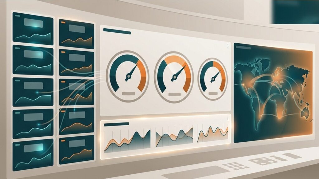
A monitoring system can include dozens of sensors across multiple locations, yet if the dashboard fails to present information clearly, operators are slow to spot anomalies. The investment in sensors, data loggers, and connectivity loses effectiveness when the data reaching the screen is not structured by urgency and decision context.
This guide provides a practical framework for designing a monitoring dashboard — covering display hierarchy, parameter visualization selection, alarm display, regulatory threshold views, multi-site organization, and role-based layouts.
The Overview–Detail–Alarm Hierarchy
ISA-101.01-2015 defines a four-level display hierarchy for HMI systems: Level 1 (area overview), Level 2 (unit overview), Level 3 (unit detail), and Level 4 (supporting/diagnostic detail). Adapting this hierarchy for environmental and industrial monitoring, a practical structure includes:
- Level 1 — All-site overview: displays the status of every monitoring station on a single screen. Key information: connection status (online/offline), active alarm count per station, and whether any parameter exceeds its threshold.
- Level 2 — Station detail: shows all parameters from one monitoring station. Current values, short-term trends, and per-parameter alarm status.
- Level 3 — Parameter trend: detailed trend charts for one or several related parameters, with time range controls and event annotations.
- Level 4 — Alarm management and diagnostics: alarm history, configuration logs, calibration status, and device diagnostic information.
This structure lets operators assess overall conditions without opening each parameter individually, then drill down only when an indication requires attention.
Choosing Display Types for Each Parameter
Not every parameter benefits from the same display format. The choice depends on how the data changes and what the operator needs to interpret.
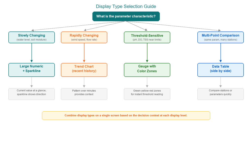
Large numerics with sparklines suit parameters that change slowly relative to the update interval — water level shifting over hours, for example. The operator reads the current value at a glance while a small sparkline shows recent direction.
Trend charts work better for rapidly changing parameters — wind speed, flow rate, or gas concentrations — because the pattern over the last few minutes provides context that a single number cannot convey.
Gauges with color zones are effective for threshold-sensitive parameters — pH, dissolved oxygen, or TSS near regulatory limits. Green-yellow-red zones give instant visual interpretation of how close the current value is to a compliance boundary.
Tables are useful when the operator needs to compare several parameters or several stations side by side — for example, comparing pH readings across four monitoring points in a single view.
The key: a single screen does not need to use only one display type. Combine them according to the decision context required at that display level.
Alarm Visualization and Priority
A dashboard that renders every alarm in the same color and size makes it difficult for operators to prioritize response. ISA-18.2 classifies alarms by priority level — typically four levels: critical, high, medium, and low — to help operators distinguish urgent from routine conditions.
Alarm visualization principles for monitoring dashboards:
Color consistency: reserve red for the highest-priority (critical) conditions. Do not use red for other status indicators on the same screen. Use yellow or amber for medium priority, and neutral colors for informational status. ISA-101 and high-performance HMI principles emphasize that the same color must carry the same meaning across every screen.
Visual hierarchy: critical alarms may use flashing elements to attract attention. Lower-priority alarms need only static color changes. The number of flashing elements on a single screen should be strictly limited to preserve their effectiveness.
Alarm rate targets: EEMUA 191 recommends that a well-managed alarm system should average no more than approximately one alarm per ten minutes during normal operation. If the dashboard continuously shows dozens of alarms, the problem is not the display — it is the alarm configuration. The guide on alarm deadband and delay discusses how to reduce repeated alarms at the signal source.
Acknowledgment workflow: display unacknowledged alarms differently from acknowledged ones. Operators need to see which alarms still require action.
Regulatory Threshold Display for Compliance Monitoring
Dashboards for regulatory compliance monitoring — such as Indonesia’s SPARING system — need to display parameter values relative to applicable regulatory limits (baku mutu). This goes beyond standard alarm display:
- Visual zones: show normal, warning (approaching the limit), and exceedance (beyond the limit) areas on gauges or trend charts. Operators and compliance officers must see how close the current reading is to the regulatory boundary.
- Exceedance duration and frequency: for regulatory reporting, the dashboard should record and display how long and how often a parameter exceeds its threshold — not just whether it currently exceeds.
- Site-specific regulatory references: regulatory limits vary by industry type, permit, and applicable regulation. The dashboard should display limits matching the specific operating permit, not generic values. Companies need to check their applicable obligations under the relevant KLHK regulations.
Multi-Site and Multi-Station Organization
When a monitoring system spans multiple locations — for example, several water quality monitoring points, weather stations, and slope displacement sensors — dashboard organization becomes critical.
Geographic map views provide spatial context: where stations are located, which ones have issues, and how conditions vary by location. Effective when operators need to understand geographic distribution and distances between monitoring points.
Hierarchical list views are more efficient for structured navigation when the number of stations is large or operators are familiar with the naming and numbering. Each entry displays a station health summary card: connectivity status, data freshness, active alarm count, and number of parameters exceeding thresholds.
An important principle: a dashboard without data-age indicators may show stale readings from offline sensors as if they were current. Ensure every station and parameter displays when the last data was received.
Consistent layout across stations helps operators switch between them without learning a new arrangement each time.
Role-Based Views: Operator, Manager, and Compliance
ISA-101 recognizes that different user roles require different display content and detail levels. A single screen designed for all users typically creates information overload for some and insufficient detail for others.
Operators need: real-time parameter values, active alarms, tools to acknowledge and respond to alarms, and short-term trend charts (1 hour, 24 hours). Operators work with Level 2 and Level 3 displays most of the time.
Managers need: KPI summaries, medium- to long-term trends (7 days, 30 days), cross-station comparisons, and availability statistics. Level 1 displays with drill-down capability.
Compliance officers need: parameter status against regulatory limits, exceedance history, violation duration and frequency, and data export for regulatory reporting. A dedicated compliance view separate from the operational display.
Role separation does not always require separate platforms — role-based views that present different information based on user login are sufficient.
Trend Display Practices: Time Ranges and Annotations
Trend charts are a core monitoring dashboard component. Several practices improve interpretation:
Time range presets: provide standard options — 1 hour, 24 hours, 7 days, 30 days — so operators can switch between short-term anomaly detection and long-term pattern recognition. The relationship between data logger intervals and trend chart resolution matters: longer logging intervals produce coarser trends.
Y-axis scaling: auto-scaling makes small changes visible, but fixed scaling with regulatory limits as reference provides consistent context. Consider offering both or providing a toggle option.
Event annotations: marking calibration, maintenance, sensor replacement, or known disturbance events on trend charts helps operators distinguish real environmental changes from measurement artifacts. The article on sensor data quality discusses how QC flags support this interpretation.
Gap visualization: when data is interrupted, the trend chart should show a gap, not a straight line connecting the points before and after the interruption. A false line hides periods without measurements.
Common Dashboard Design Mistakes
Several design patterns consistently reduce operator effectiveness in responding to abnormal conditions:
Too many gauges: excessive use of analog-style gauges on a single screen actually slows operator response compared to organized numeric and trend displays. Gauges work well for a few threshold-sensitive parameters, but they are not the default choice for every measurement.
Inconsistent color meaning: if green means “online” on one screen and “normal value” on another, operators face misinterpretation risk. Define a color standard once and apply it consistently across all displays.
No data freshness indicator: without information about when data was last updated, readings from offline sensors look identical to current readings. This leads to decisions based on data that is no longer valid.
Overwhelming overview screen: an overview screen that tries to display every parameter from every station simultaneously defeats its purpose. Level 1 should help operators assess overall conditions in seconds, not present every detail.
Hidden alarm history: if operators can only see active alarms without easy access to history, recurring alarm patterns and escalating conditions are difficult to identify.
When to Involve a System Integrator
An effective monitoring dashboard requires understanding not only visual design principles but also the data architecture from sensor to server. Consider involving a system integrator when:
- The system includes multiple sensor types and monitoring products — for example, integrating AWLR, AQMS, and SPARING data into a single dashboard platform.
- Custom compliance views with automatic exceedance calculations are needed.
- The dashboard must integrate with SCADA or OPC-UA systems.
- Multi-site organizations need federated dashboards with centralized access.
Fortuna Argatech delivers dashboard integration as part of its monitoring system solutions, covering multi-parameter visualization, alarm configuration, and data logger connectivity across all product lines. Contact the technical team to discuss your monitoring dashboard requirements.
Share this article
Share this insight with your team.
Related Articles
Similar topics from the same category.
Poor weather station placement can cause 50% data bias. Learn the WMO-No. 8 and Indonesian BMKG siting standards for AWS sensors in industrial and mining sites.
Explore a technical engineering comparison between solid-state ultrasonic anemometers and mechanical cup-and-vane sensors for industrial weather stations.

Technical guide to conductivity sensors: comparing toroidal (inductive), 2-electrode, and 4-electrode contacting probes for industrial water and wastewater.